4th July – Paintings of Plymouth, MA

PAINTINGS OF THE WEEK 
4th July to 11th July 2018
In honour of 4th July, this week’s paintings feature the spot where the Pilgrims
 landed in Plymouth, Massachusetts. My lovely wife is from just a few miles North in Boston. We enjoyed fresh lobster in this very town where the first Thanksgiving meal was celebrated.
“Plymouth Pier”
12 x 10 inches, oil on board

(click image to enlarge)

“Plymouth Harbor”

12 x 12 inches, oil on board
(click image to enlarge)

Watching Time Go By

PAINTING OF THE WEEK 
27th June to 4th July 2018
“Watching Time Go By”
24 x 12 inches, oil on board

(click image to enlarge)

Once again I am thinking of the stages of life, the elderly contemplating the rush of youth.  For much of the life of the painting, there was a walking mother on the left side, at whom the old man was looking. However, I found that her head in the top left was taking all the attention; we couldn’t get past her. In desperation, she was reduced to a foot, travelling apace to catch the runaway child.

By the way, the gentleman also appears in my 12 foot painting “The Bench”, but his wife sadly was painted out.
 

Hannah

PAINTING OF THE WEEK 
20th to 27th June 2018
“Passage”
20 x 20 inches, oil on board

(click image to enlarge)

Hannah is an enigmatic, talented young lady. We met when I gave a talk at her Art College and she is now launching her musical career with the band “Dream English Kid.” The two small paintings of Hannah below have already sold and the top one was shown  at the Mall Galleries, London, in the New English Art Club Exhibition.

The painting of the week presents the relaxed, contemplative Hannah, very different to her stage presence. The armchair, fireplace and decorations were set up in the studio to give a domestic feel. The title refers not only to a section of the book but to this transitional period in her life after Art school.

Hannah, 8 x 10, SOLD

Of Another Time, 8 x 10, SOLD

See more paintings from life here

Going The Distance

Norman Long’s most ambitious painting to date.
“Going The Distance”
89 x 59 inches, 225 x 150cm, oil on linen

(click image to enlarge)

Newly married and enjoying long beach walks near our home in Lytham St Annes, this monumental painting records my contemplation of a future life together. The young couple, actually based on a photo I took on honeymoon in Venice, look towards the middle distance, where as parents they are busied with children and responsibilities. The sunlit far distance is where they once again walk side by side, reflecting upon the distance they have travelled together.

The canvas is the largest dimensions that would fit on the studio wall. The setting is based on many drawings and small studies (like the one below) done on the beach. As you can see, St Annes pier once featured in the painting but was distracting from the true message so was painted out.

The little girl (below) in “Going the Distance” also appears, albeit walking the other way,  in “Divided Interest”.
 –

Painting in Berkley Square

History in the making. I’ve sketched in London plenty of times but here I am for the first time ever painting in the big smoke.

This was right after a really relaxed meeting with Geoffrey and Ellie of the Osborne Studio Gallery in Knightsbridge where I will be having a show early next year. My painting buddy Michael Ashcroft is joining me on these painting excursions over the next few months.

Norman Long Artist BLOG

Welcome to the NEW Norman Long Artist BLOG PAGE

To welcome you, here is my palette

My new extended palette of about 25 colours

For a few months I have been working solely in monochrome – drawings and acrylic under paintings. When I came to the point of re-enteringthe world of colour, I realised that I was somewhat bored with my existing palette of colours. I began looking at what exotic creatures other artists had on their palettes and reading why they had made the choices they had. With my original selection, I could paint any colour I saw, but I simply wasn’t having much fun.

So here they are, my new team:

CHROMATIC COLOURS:

WINSOR LEMON (Arylide)

CADMIUM YELLOW LIGHT

CADMIUM YELLOW

CADMIUM ORANGE

CADMIUM SCARLET

CADMIUM RED / GERANIUM LAKE (Quinacrodone)

PERMANENT ROSE (Quinacrodone)

MAGENTA

DIOXAZINE PURPLE

ULTRAMARINE BLUE

PHTHALO BLUE

PHTHALO TURQUOISE

VIRIDIAN HUE (Phthalo)

COBALT GREEN LIGHT / COBALT TEAL

EMERALD GREEN

PERMANENT GREEN LIGHT


EARTH COLOURS:

NAPLES YELLOW

BURNT SIENNA

LIGHT RED

INDIAN RED

INDIGO / PAYNES GREY / LAMP BLACK

OXIDE OF CHROMIUM / TERRE VERTE

RAW UMBER


TWO APPROACHES: Full Palette from life, limited palette for invention

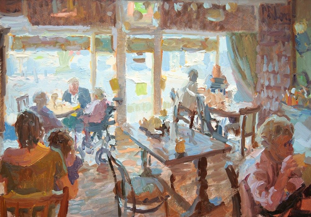
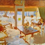
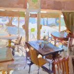
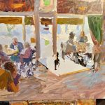
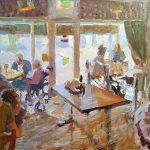
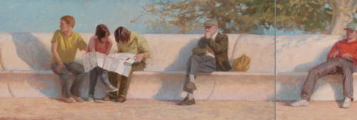
With these developments in mind, I have been looking at art with a strong colour bias. Camille Przwodek uses a full palette to find rich colour in painting from life.

Camille Przwodek Figure Study 9×12


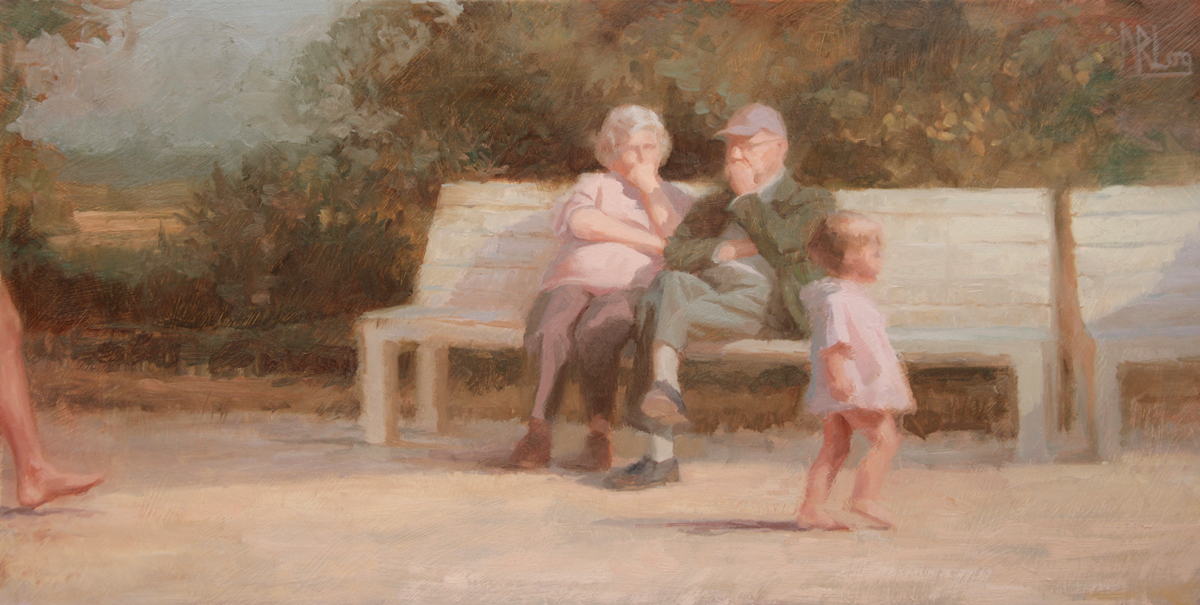
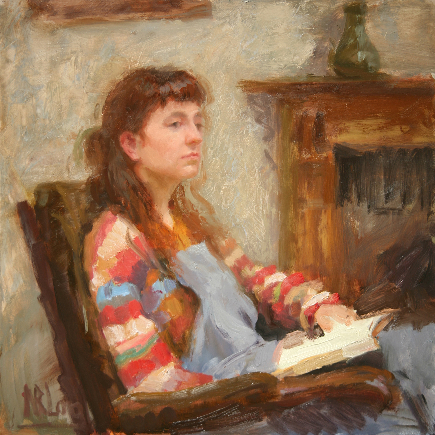
In her compositions with invented colour, Susan Lichtman finds exciting harmonies through selecting just three “primaries” and white in order to hold the painting together. She says”The Red might be venetian or cadmium, the Blue might be a cobalt or ultramarine or black or even a green; and the Yellow might be yellow ochre or a cadmium.” Later in the painting, she may add a fourth hue.

Susan Lichtman Family at Sundown 56 x 72 ins


To see earlier blog posts 2010-15, check out normanlongartist.blogspot.com